ticalc.org
Basics Archives Community Services Programming
Hardware Help About Search Your Account
   Home :: Archives :: News :: Welcome to Our New Server

Welcome to Our New Server
Posted by Henrik on 4 October 2003, 09:19 GMT
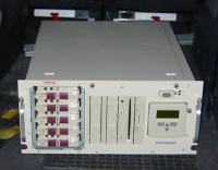
If you are reading this, then you are visiting us at our new server.

After two years of planning and behind-the-scenes work, we have finally retired our old trustworthy Pentium 200 MMX, 128 MB memory, running Linux 2.2. On our Hardware and Software page, you can read more about the new hardware in our main server and what software we use as of now.

Basically, we now have a dual processor machine, lots of memory, and hard disks in a RAID 5 configuration that gives four times as much disk space as before. We have also moved up to Linux 2.4 and Apache 2.0 (from 1.3).

But it is not all hardware and server software. More behind-the-scenes work has been done on our in house software solutions. We took the time to streamline and optimize, sometimes rewrote parts of our systems and services to better serve you in the years to come.

This upgrade will enable to us to extend, enhance, and add new features to the ticalc.org you know and love. Once again, welcome to our new server.

(The photo shows the new server in the back of Magnus' car on 28 October 2002 when he picked it up from Henrik.)

Update (Henrik): You should also note better response and download times from our web server. The first reason is Apache MPM worker that gives us a hybrid multi-threaded multi-process server instead of the old non-threaded, pre-forking server. The second reason is mod_deflate that compresses content before it is delivered to the client. Both these new features will most of the time decrease download time per page at least tenfold.

Update (Henrik): Buy & Sell service has been retired as there are better similar services out there.

Update (Henrik): Site Map is gone as we believe our site is easy enough to navigate anyway.

Update (Henrik): Hosted sites are able to update their sites again.

Update (Henrik): Our file archivers are processing the incoming queue once again. Please report any problems.

Update (Henrik): Hosted sites should ftp to their hostname in order to update their site, not ftp.ticalc.org, as it does not exist anymore.


The comments below are written by ticalc.org visitors. Their views are not necessarily those of ticalc.org, and ticalc.org takes no responsibility for their content.


Hosted Sites Now Up
henrik Account Info
(Web Page)

Hosted sites are again available. All hosted sites owners will be contacted with information in how to update their sites.

     5 October 2003, 00:00 GMT

Re: Hosted Sites Now Up
Kevin Kofler
(Web Page)

Thanks. :-)

     5 October 2003, 01:19 GMT


Re: Hosted Sites Now Up
henrik Account Info
(Web Page)

And if you have a hosted site at ticalc.org and have yet to receive information from me, then you did not have a valid email address registered with us. Contact webmaster for further help.

     5 October 2003, 01:23 GMT

Re: Welcome to Our New Server
John Albright  Account Info

Wow, that is faster! Except, i wish they would fix the big sections like the 83 Plus games programming page so you didn't have to scroll over to the right (hint, hint).

-TrumpetMan

     5 October 2003, 02:16 GMT


Re: Re: Welcome to Our New Server
Morgan Davies  Account Info
(Web Page)

I think you are referring to the the 83plus/basic/math/ page. Because the 83plus/basic/games/ folder looks fine. The math page had that error but I fixed that a couple days ago, thank to a report by Dwedit.

     5 October 2003, 08:47 GMT


Re: Re: Re: Welcome to Our New Server
John Albright  Account Info

Sorry, i guess I didn't make myself clear. I was referring to the upcoming programs/83 plus games page. You have to scroll over to the right, and it's SO annoying!

-TrumpetMan

     6 October 2003, 00:39 GMT


Re: Re: Re: Re: Welcome to Our New Server
Morgan Davies  Account Info
(Web Page)

I'm not seeing anything wrong with it, but one od the other admin's might have fixed it.

     7 October 2003, 08:40 GMT


Re: Re: Re: Re: Re: Welcome to Our New Server
John Albright  Account Info

Nope. It's still the same.

-TrumpetMan

     10 October 2003, 12:08 GMT


W Hibdon  Account Info

Put the link to the opage in the url of a post, so they can know exactly what you mean.

-W-

     10 October 2003, 17:10 GMT


Re:  
John Albright  Account Info
(Web Page)

Sorry. Click the link.

-TrumpetMan

     10 October 2003, 20:36 GMT

Re: Re:  
W Hibdon  Account Info

I did not even know that section was there!

That is nothing. It is like that on this page. Atleast on my computer. It happens when a lot of people pose, and instead of the post having one character per line, it makes the page bigger.

-Like microsoft says, it is not a bug, it is a feature, and I am W-

     10 October 2003, 23:31 GMT


Re: Re: Re:  
John Albright  Account Info

You didn't know that section was there? Wow.
Well, I still hate scrolling over to the right.

-TrumpetMan

     11 October 2003, 13:21 GMT


Looks Fine!
Morgan Davies  Account Info
(Web Page)

Still looks fine to me, maybe someone else fixed it without posting it.

     11 October 2003, 16:58 GMT


Re: Looks Fine!
John Albright  Account Info

Again, nope.

-TrumpetMan

     11 October 2003, 22:10 GMT

Re: Re: Looks Fine!
W Hibdon  Account Info

Nor will it ever look fine, unless MV decided to get rid of year old posts. It will always look as it does now, much as this page will look as it does now.

-That is how it is, deal with it, I am W-

     12 October 2003, 14:56 GMT


Re: Re: Re: Looks Fine!
John Albright  Account Info

I guess you're right.

-TrumpetMan

     12 October 2003, 15:35 GMT


Re: Re: Re: Re: Looks Fine!
Chickendude Account Info
(Web Page)

Yes sir
-SuperMan

     16 October 2003, 00:05 GMT


Re: Re: Looks Fine!
Morgan Davies  Account Info
(Web Page)

Well I clicked that link you provided and nothing shows up wrong with my browser. I'm using IE 6 and my screen resolution is 1,024 X 768. I am guessing that your screen resolution is too small to display the page correctly.

     16 October 2003, 23:54 GMT


Re: Re: Re: Looks Fine!
John Albright  Account Info

Mine is 800 X 600. That might be the problem.

     17 October 2003, 00:40 GMT


Re: Re: Re: Re: Looks Fine!
W Hibdon  Account Info

Drop it! I already explained the problem. Instead of it showing one letter per line, it expands the page. That is all that it is, to make the page readable.

-Look there, a cricket. Look now, a dead cricket, W-

     17 October 2003, 01:10 GMT

Re: Welcome to Our New Server
JcN  Account Info

Hmm...I don't know if this is a problem with AOL 8.0, but for some reason whenever I scroll down through the responses, it's jerky and not smooth. Also, whenever I move my pointer over a hyperlink, it takes a noticeable delay (about 1-5 seconds) for it to change from blue to red. It's probably me, though, because my city's servers only run at 28.8K, even though I have a 56K modem :(

     5 October 2003, 05:17 GMT

Re: Re: Welcome to Our New Server
Travis Evans Account Info

That sounds more like a software problem than an internet connection problem.

     5 October 2003, 15:58 GMT


Re: Re: Welcome to Our New Server
no_one_2000_  Account Info
(Web Page)

I think that's more of a problem on your computer isntead of the server. Probably just the slow connection or something. Or maybe it's your system resources. My computer does weird stuff when they get low. (BSOD!)

     5 October 2003, 19:47 GMT

1  2  3  4  5  6  7  

You can change the number of comments per page in Account Preferences.

  Copyright © 1996-2012, the ticalc.org project. All rights reserved. | Contact Us | Disclaimer